
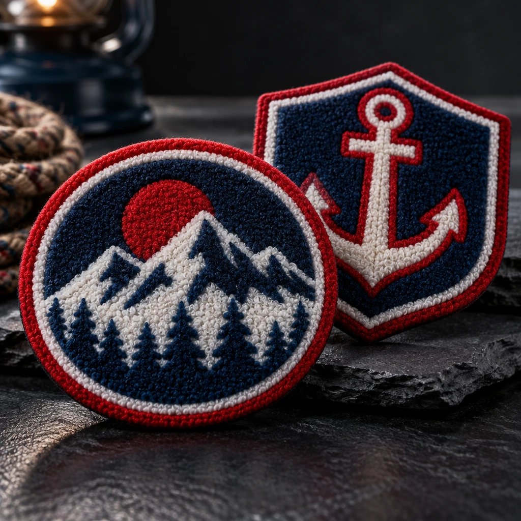
Don't make small lettering out of chenille. Small text on chenille patches can work when it is flat-embroidered on an exposed felt area, while the raised chenille handles the large letters or main shape.
Why does small text on chenille patches lose definition?
Chenille's raised yarn pile softens the edges that small lettering needs to stay distinct. In our production experience, the weak spots are usually enclosed spaces, narrow gaps between strokes, and letters crowded together, not the overall size of the patch.
Chenille is a raised-yarn patch material that creates a soft, textured surface, commonly over a felt base. That texture is the reason to choose it for a varsity letter or a broad mascot shape. It is also the reason not to expect it to behave like a printed label. A letter needs open space as much as it needs a visible outline.
Consider the difference between a large block L and a small lowercase e. The L has broad strokes and an open shape. The e depends on a small interior opening and a short crossbar remaining separate. As the lettering shrinks, the pile can visually crowd those features. Adding a contrasting color may make the word stand out from the background, but it cannot reopen a closed letter.
Patch width is a poor shortcut. For example, a 4-inch patch with a large central letter and a long club name may leave less useful lettering space than a simpler 3-inch patch with one short word. Those are layout examples, not production limits. Ask how tall the actual letters will be, where their baseline sits, and how much flat space surrounds them.
Font choice matters, too. Wide block capitals generally give the construction more room than narrow script, hairline serifs, or tightly connected lettering. But capitals are not a cure by themselves. An A still needs an opening, an R needs a distinct bowl and leg, and a long line of capital letters can become crowded very quickly.
I'd also separate what must read across a room from what only needs to read close up. A team initial on a letterman jacket is a distance element. A founding date is supporting information. Making both equally large wastes space; making both chenille creates an unnecessary production problem. Good hierarchy is more useful than trying to preserve every feature of the original logo.
That is the practical dividing line for teams, brands, clubs, and businesses in the United States. Choose chenille patches because you want the raised varsity texture to carry the design. If the main purpose is to communicate a long name in a small area, start with a material that serves the name instead.
When should you combine chenille with flat embroidery?
Combine them when the design has one large, simple feature and a short line of smaller information. Keep the chenille in the main feature and place the small embroidery on exposed felt, with enough separation that the surrounding pile does not crowd the lettering.
Flat embroidery is thread stitching that builds lettering and shapes without chenille's raised yarn pile. It gives supporting text a more controlled edge, though it still has limits. Fine embroidery is not ink. A miniature slogan can remain too small even after the material changes, particularly when the font has narrow openings or the available line is short.
For example, a school jacket patch could use a large chenille initial with a short team name embroidered in a felt strip below it. The strip must be part of the layout from the beginning. It should not be whatever sliver of background remains after the chenille shape, outline, and outer edge have taken their share.
Layer order deserves a direct conversation. Asking for flat embroidery on a chenille patch is not the same as asking for tiny stitches buried in a fluffy surface. Specify the intended result: readable embroidery on a flat, visible base area. The production plan can then account for stitching order, pile clearance, and how the different materials meet.
Borders consume space as well. A felt-cut edge and a stitched outline do not occupy the same visual area, and an embroidered frame around a name can squeeze the letters further. If a merrowed border is requested, confirm that it suits the patch shape and construction. Don't treat any border as a free addition to an already crowded design.
The strongest argument for all-chenille lettering is consistency. A bold athletic mark can look better when every major letter shares the same pile and texture. I agree, provided the words are short and the letters have room. Enlarging the patch or deleting a secondary line may be a better design decision than adding a small embroidered panel that fights the original style.
See your artwork as a custom USA patch before you buy. Free digital mockup in 12 hours — 5-piece minimum per design. We do not produce until you approve.
GET A FREE MOCKUPThere is a cost argument against mixing processes, too. Combining chenille with embroidery can add production work, so it should earn its place. If an all-embroidered version comes back lower in the quote and still meets the visual brief, that less expensive option is enough. Paying for chenille does not help a uniform name patch whose main job is quick identification.
Where the logo is mostly small lettering, woven patches deserve a look because their finer woven structure can support detail without chenille pile. They sacrifice the plush varsity surface. That is an honest trade-off, not a downgrade. Choose the texture only if people will notice and value it on the finished garment.
If the small line matters, request a free digital mockup comparing the mixed-material layout with an all-embroidered patch. Seeing where the words sit is more useful than debating materials without a finished size.
What should you check before approving the lettering?
Check the actual letter height, usable background space, and garment placement before approving the design. A digital mockup establishes the layout, but it does not physically reproduce yarn pile, thread sheen, or the way a finished patch bends on a garment.
The screen is forgiving. Zooming in can make a cramped name look clean because you are effectively viewing a much larger patch. Review a correctly scaled printout or another verified actual-size representation. Hold it against the intended jacket, cap, or sweatshirt. This checks proportion and viewing distance, though it still cannot certify how the stitched letters will form.
- Set the finished width and height first. Include the full outer edge, not just the central artwork. For example, a 3-inch-wide drawing with an added felt margin is no longer the same 3-inch finished patch unless the interior design is reduced.
- Identify the smallest required line. Ask for its actual letter height in inches and name the font. Do not approve a layout based only on the overall patch dimensions when a date, chapter name, or sponsor line is essential.
- Mark the construction areas. The mockup should make it clear which elements are chenille, which are flat embroidery, and which portions are exposed felt. An ordinary color drawing can otherwise conceal a major difference in intended texture.
- Check the difficult letter combinations. Look at enclosed letters, repeated vertical strokes, punctuation, and spaces between words. In our production experience, those details often reveal a cramped line sooner than a quick glance at the whole word.
- Confirm backing and attachment with the garment in mind. State whether the order needs sew-on construction, heat-seal backing, or hook-and-loop backing. Each choice affects installation, and none repairs lettering that is too small.
- Approve the final specification in writing. Include spelling, dimensions, thread and felt colors, border treatment, backing, and quantity. If a late change affects one of those items, review the revised layout rather than relying on an earlier approval.
Sew-on is my starting point for a chenille patch on a letterman jacket, subject to the jacket's construction and access for stitching. Heat application needs a separate compatibility check. Wool blends, leather sleeves, coated nylon shells, and polyester performance garments do not all tolerate the same heat and pressure. The garment manufacturer's care guidance matters more than a general claim that a backing is iron-on.
Caps bring another constraint: curvature. A thick patch that looks balanced on a flat drawing may feel oversized on a structured cap front, and a center seam can interfere with placement. For a small cap logo with supporting text, I'd usually start with a flatter embroidered construction. Reserve chenille for a deliberately bold design with a placement the cap can accommodate.
Contrast should be reviewed by material area, not only by logo color. Small dark embroidery on dark felt can disappear even when the chenille letter beside it is bright. A separate felt panel can help the words read, but it also changes the look. Ask to see that change rather than assuming the production team will silently introduce a new background color.
USA Customized Patches has a 10-piece minimum per design. A free digital mockup is provided in about 12 hours before production, and production starts only after written approval. Treat that mockup as a specification review, not as proof of a physical sample. If small lettering is the deciding factor, ask what physical verification is available before authorizing the full order.
Typical production takes 7–12 business days after approval, with the order-specific schedule confirmed before the run. USA Customized Patches ships from Corona, CA, to all 50 states. Review United States shipping information separately from production timing; a production window is not an arrival promise for a school ceremony or club event.
Which approach should teams, brands, and clubs choose?
Teams should usually preserve the bold chenille element, brands should protect the identity's essential lettering, and clubs or businesses should prioritize readable identification. The right choice depends on what the patch must communicate on the garment, not on which material looks most impressive in isolation.
School and sports teams: give chenille the main letter
For a letterman jacket or team sweatshirt, chenille is the right call when the large initial or mascot silhouette carries the identity. Put a short team name or year in flat embroidery on exposed felt. Keep that supporting line visually secondary. The goal is not to turn a varsity patch into a roster.
Ready to spec type, size, backing, and quantity? Open the quote form for a free 12-hour mockup and USA shipping after approval.
GET A FREE MOCKUPFor example, a team ordering jacket patches could keep one shared chenille design and put individual player names elsewhere on the garment. That preserves space for the main mark and avoids crowding each patch with variable text. Confirm how personalized versions affect quantities and quoting before assuming every name can be treated as the same design.
Apparel brands: protect the wordmark before the texture
A brand whose identity depends on a narrow script or tightly spaced wordmark should not force that artwork into small chenille lettering. Either approve a simplified chenille version for the garment or use another patch construction. Changing the lettering until it is technically sewable can leave you with a readable mark that no longer looks like your brand.
Placement should settle the argument. A large jacket-back statement gives chenille room; a small sweatshirt chest mark or cap-front logo does not provide the same canvas. Mixed construction works when the chenille symbol can remain bold and the wordmark has a genuinely usable flat area. If the whole patch becomes embroidered detail around a token fuzzy accent, I'd question the added process.
Clubs and businesses: make the name easy to read
For a club jacket, chenille can carry a broad initial while embroidery handles the chapter name. For a work shirt or business uniform, I'd usually skip chenille when the primary requirement is a readable company name in limited space. An all-embroidered patch often fits that job more directly and avoids choosing a raised texture for information that needs clean edges.
A long club name is a content problem before it is a stitching problem. Use an approved abbreviation, move the location to a separate garment detail, or increase the patch size if placement permits. Don't solve the conflict by shrinking everything equally. That preserves every word in the artwork while making the finished message harder to use.
For any of these buyers, request quotes against matching specifications. Keep dimensions, quantity, backing, and required wording consistent when comparing all-chenille, mixed, and all-embroidered options. Ask for the total in US dollars and clarify what shipping and any requested physical verification include. A lower quote for a smaller patch with fewer details is not a material comparison.
What this advice is based on
This advice rests on the patch-production process, the digital mockup review, and the order specifications that determine how a design can be built. In our production experience, letter shape, spacing, pile height, material separation, and finished placement matter together. There is no single minimum letter height that makes every font readable on every chenille layout.
A digital drawing can confirm intended dimensions and material zones; only a physical piece can show the actual pile and stitched result. That distinction is why recommendations here are layout decisions, not universal promises about tiny lettering. No customer testimonials, outside studies, or unverified performance figures are needed to explain the trade-off.
USA Customized Patches is open 24 hours a day, 7 days a week for quotes. For your free digital mockup, send the intended garment, finished patch dimensions, and the exact smallest line of text. Mark that line as required so the layout is built around it instead of squeezing it in afterward.