
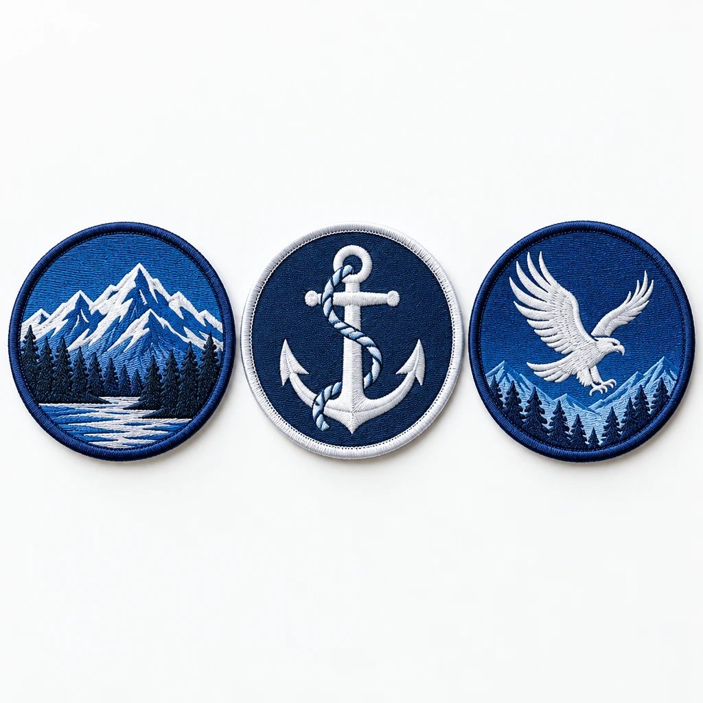
The most expensive mistake with custom patch ideas veteran groups approve is ordering the full run before checking the design at its actual size on the intended garment. Start with a clear chapter emblem, reunion badge, remembrance design, or service-project patch, then match its lettering, material, and backing to the jacket, cap, or vest. Approve those details before production, not after the patches arrive.
A patch has a small working area. It cannot carry everything a group cares about with equal emphasis, especially when the same artwork is expected to work on a ball cap and the back of a riding vest. The useful question is not how much symbolism you can squeeze in. It is what another member should recognize first.
The eight mistakes below cover the decisions that tend to create avoidable rework: scale, content, construction, attachment, edge shape, symbolism, placement, and order planning. Examples are hypothetical layouts, not accounts of customer orders.
How do you check a veteran patch before ordering?
Check a patch at the exact ordered dimensions and against the actual garment before approving it. Mistake 1 is treating an enlarged digital proof as evidence that the finished patch will be readable and fit correctly.
What it looks like: The chapter name turns into a narrow band of thread, the center emblem feels oversized, or the patch overlaps a pocket seam. On a structured cap, the sides may extend into a curve where the patch will not sit flat.
Why it happens: A phone or monitor lets you zoom until every letter looks clear. That hides the relationship between letter height, stitch thickness, border width, and the usable area inside the patch. It also removes the garment from the decision.
The fix: Print the approved outline at actual size, verify it with a ruler, and place the paper shape on the garment. Check the smallest wording without zooming, then enlarge the patch or remove content if it does not read comfortably.
For example, a 3-inch-wide chest patch and a 3-inch-tall shield are not equivalent specifications. A shield may have much less usable width near its bottom, precisely where a designer has placed the location or founding date. State both width and height, and make clear whether those dimensions include the border.
A digital mockup is a visual approval document that shows the proposed layout, colors, dimensions, and construction notes. It is not a physical stitch sample, and a screen cannot establish exact thread texture or color. If a feature is critical, ask how it will translate into the selected material.
You can request a free digital mockup of an embroidered veteran group patch with the intended garment and dimensions noted. That gives the group something specific to review instead of debating a loose sketch.
How do you turn custom patch ideas veteran groups suggest into one clear design?
Give the patch one primary message, then make everything else support it. Mistake 2 is combining a chapter identity, service history, memorial, fundraising message, and event schedule into the same small design.
What it looks like: Several emblems compete in the center, curved text crowds the edge, and the most important name is no easier to find than a minor date. From a normal conversation distance, the patch reads as texture rather than information.
Why it happens: Committee edits usually add content. A member suggests a motto, another requests a service-era reference, and someone wants the full city and state. Nothing comes out, so every addition makes the existing elements smaller.
The fix: Choose one dominant identifier, one supporting symbol, and only the secondary wording needed for the patch's purpose. Move changing details to a separate event patch, tab, or printed handout instead of shrinking the whole composition.
- Chapter identity example: A group name around a simple center emblem, with the location beneath it. This works for a recurring jacket patch because the information stays useful.
- Reunion example: A service connection or unit reference, the reunion year, and the host location. Leave the meal schedule and venue address off the patch.
- Volunteer project example: The group name and a recognizable service symbol, such as a simplified tool or helping-hands motif. The design should describe the project without looking like an official credential.
- Remembrance example: A restrained emblem with the approved name and dates. Give the wording room rather than surrounding it with every available symbol.
- Mixed-service group example: One shared group mark with supporting branch references only if they remain legible and balanced.
I'd separate the permanent chapter design from the annual event design. Members can keep wearing the chapter patch without displaying an outdated year, and organizers do not have to reopen the group's entire visual identity for every reunion.
Should veteran group artwork be embroidered, woven, printed, or PVC?
Choose the construction that preserves the important parts of the artwork at the finished size. Mistake 3 is choosing a material first and assuming every emblem, photograph, and line of text will reproduce equally well in it.
What it looks like: Small embroidered letters close up, a portrait loses recognizable features, or a detailed insignia becomes a cluster of indistinct shapes. The opposite mismatch happens too: a flat printed design may disappoint a group that expected the raised texture of traditional stitching.
Why it happens: Each process builds the image differently. Embroidery uses stitches with physical thickness and direction; woven construction creates flatter thread detail; printing reproduces artwork on a surface; molded polyvinyl chloride, commonly called PVC, uses shaped areas and raised or recessed features.
The fix: Identify the detail that cannot be lost, then select the process around that requirement. Simplify the artwork for embroidery, choose woven construction for finer flat detail, or consider printing when a photograph or tonal shading is essential.
| Construction | Good veteran group use | Main trade-off | What to check on the mockup |
|---|---|---|---|
| Embroidered | Chapter emblems, jacket patches, bold reunion badges | Raised thread texture suits traditional designs but limits very small detail | Letter openings, stitch direction, exposed base fabric, and border |
| Woven | Compact reunion designs with fine lettering or detailed linework | Finer flat detail, but less raised texture than embroidery | Small wording, line separation, and edge finish |
| Printed | Photo-based remembrance artwork or designs with tonal shading | Preserves image detail but does not provide a stitched image texture | Source-image quality, contrast, cropping, and border |
| PVC | Removable outdoor gear patches with bold shapes | Molded relief suits simplified artwork, not every fine insignia detail | Raised levels, separated color areas, thickness, and attachment |
For a straightforward chapter name and bold emblem, embroidery is the right call when the group wants visible thread texture. Full thread coverage is not automatically better. An exposed twill background can keep the design clear and avoid unnecessary stitching when the artwork does not need a filled field.
If the wording must remain compact, compare woven patches for fine lettering before increasing the patch beyond the available space. In our production experience, switching construction can solve a detail problem more cleanly than repeatedly squeezing the same artwork into embroidery.
Which patch backing works on jackets, caps, and riding vests?
Match the attachment method to the garment fabric, access for sewing, and need for removal. Mistake 4 is ordering one backing for every member without checking what they plan to wear.
See your artwork as a custom USA patch before you buy. Free digital mockup in 12 hours — 5-piece minimum per design. We do not produce until you approve.
GET A FREE MOCKUPWhat it looks like: A patch lifts at the edge, sits stiffly on a soft garment, or arrives with hook backing when the jacket has no matching loop panel. Heat-sensitive fabric may also show damage if someone tries to press on a patch without checking the garment instructions.
Why it happens: Backing gets treated as a finishing detail instead of an attachment system. Members may be using denim jackets, leather riding vests, coated nylon shells, and structured caps, all under the same group order.
The fix: Collect the garment type before specifying backing and use separate attachment specifications when necessary. Choose sew-on for permanent attachment where sewing is practical, hook backing for compatible loop panels, and iron-on only when the garment can tolerate the required application process.
Hook-and-loop backing is a removable attachment system that joins a hook surface on the patch to a compatible loop surface on the garment. Confirm which side is included. A hook-backed patch alone does not turn an ordinary jacket into a removable-patch jacket.
I'd skip iron-on as the default for leather riding vests. Heat and adhesive compatibility are not details to guess at, and sewing leather requires care because needle holes remain. A garment professional should also check lining access and pocket placement before stitching.
For a cap, attachment is partly an access problem. The sweatband, center seam, and crown structure can interfere with sewing or pressing. For a lightweight performance shirt, a large dense patch can pull on the fabric even if the attachment holds perfectly. Smaller and lighter may be the better specification.
How should you choose a border for a detailed veteran emblem?
Use a border that protects the edge without consuming the artwork or distorting the silhouette. Mistake 5 is adding a thick wrapped border to a shape with narrow points, deep notches, or lettering too close to the edge.
What it looks like: The border crowds the group name, sharp corners appear rounded, and small extensions lose their intended shape. A narrow flagstaff, wingtip, or ribbon end may become visually heavier than the symbol it belongs to.
Why it happens: The outline is drawn as if it has no manufacturing width. A border occupies real space, and different edge finishes handle curves and corners differently.
The fix: Keep important artwork inside a clearly defined safe area and select the edge finish before approving the layout. Use a merrowed border for suitable simple outlines, or discuss a cut edge with a stitched outline when the shape needs more intricate contouring.
A merrowed border is a wrapped thread edge that gives a patch a raised, rounded perimeter. It is a sensible choice for many circles, ovals, and rounded rectangles. It is not a universal solution for every silhouette.
For example, an eagle design can sit inside a simple oval instead of using every feather as part of the outer edge. The oval gives the lettering a predictable area, simplifies attachment, and keeps the bird recognizable. That is not watering down the idea. It is moving the detail to a place where the construction can support it.
Border color matters as well. A contrasting edge helps separate a dark patch from a dark jacket, while a matching edge makes the outline quieter. Check both against the garment color rather than choosing from an isolated artwork preview.
How do you verify military symbols, names, and dates?
Have the group verify every identifying symbol and line of wording before production approval. Mistake 6 is treating familiar military imagery as interchangeable or assuming the person preparing the artwork can validate the group's history.
What it looks like: The finished patch carries the wrong abbreviation, an incorrect date, a misplaced insignia element, or a layout that implies an affiliation the group did not intend. These are not small cosmetic defects when the patch represents service or remembrance.
Why it happens: Artwork may come from a low-resolution screenshot, an old flyer, or several reference images that disagree. Committee members sometimes approve the overall appearance without reading the final text character by character.
The fix: Assign one person to collect the group's verified wording and approved reference artwork, then have an authorized group representative approve the final proof in writing. Resolve questions about emblem use, affiliation, and permissions before production rather than asking the patch maker to infer them.
Keep the review specific. Check branch names, unit references, punctuation, founding dates, memorial dates, and the spelling of every personal name. If a flag is included, verify the intended orientation for the placement and purpose instead of automatically mirroring the artwork.
A civilian veteran group patch should communicate the group's actual identity. Avoid adding rank, qualification, or agency-style elements merely because they fill an empty space. For mixed-service membership, review how each service connection is represented and whether the proposed balance matches the group's purpose.
Memorial artwork deserves a separate wording review. Where appropriate, ask the family or designated organizer to confirm the name, dates, and intended presentation. Do not rely on the design committee's general approval to cover a sensitive detail nobody explicitly checked.
Can one patch design work on a cap and a riding vest?
One visual identity can work across several garments, but the exact same layout often cannot. Mistake 7 is scaling a large vest-back design down for a cap without changing its content or proportions.
What it looks like: The cap version has unreadable curved wording, the jacket version looks lost above a pocket, or the vest patch collides with existing patches and seams. The artwork may be consistent, but the result does not feel intentional.
Why it happens: Scaling changes every element at once, including details that were already near the practical limit. Garments also offer different shapes of usable space, not simply larger or smaller versions of the same rectangle.
Ready to spec type, size, backing, and quantity? Open the quote form for a free 12-hour mockup and USA shipping after approval.
GET A FREE MOCKUPThe fix: Build a simplified companion layout for smaller placements while keeping the same central emblem, color family, and naming convention. Measure each garment location separately, including seams, pockets, closures, and existing patches.
For example, a group might use a 9-inch-wide back design on a riding vest and a separate 3-inch-wide emblem on a cap. The cap layout could retain the center mark and short group name while dropping the long motto and location line. Those example sizes are starting points for a fit check, not universal recommendations.
On riding apparel, review the entire arrangement rather than treating each patch as an isolated decoration. Large top and bottom text sections, club names, and place names can carry meanings within riding communities. The group should settle its own identity and placement conventions before ordering patches for biker and motorcycle apparel.
For volunteer events, recognition may matter more than decoration. A simple emblem on a chest pocket can identify members at a check-in table without dominating the shirt. For a presentation jacket, a larger embroidered design may be appropriate. Same group. Different job.
How do you avoid reorders, budget surprises, and missed event dates?
Finalize the design versions, attachment requirements, quantities, and delivery deadline before accepting the quote. Mistake 8 is counting patches first and discovering later that the order actually contains several different products.
What it looks like: Some members receive the wrong backing, an annual patch displays the wrong year, or organizers run short after giving pieces to volunteers and guests. A rushed replacement may no longer fit the event schedule.
Why it happens: The order count includes paid members but not display pieces, presentation gifts, replacements, or different garment versions. Production time may also be confused with the complete period from initial inquiry to delivery.
The fix: Build a written order breakdown and work backward from the date the patches must be in hand. Confirm how artwork changes, backing splits, production, and transit affect the quote and schedule before approving.
USA Customized Patches has a 10-piece minimum. A free digital mockup is provided in about 12 hours, and production starts only after written approval. Typical production is 7–12 business days; confirm the schedule for the approved specifications and allow for shipping separately.
USA Customized Patches accepts quote requests 24 hours a day, 7 days a week. Orders ship from Corona, CA, to all 50 states across the United States. Review the shipping information for patch orders and confirm the delivery estimate for the actual destination before setting a distribution date.
Ask for the quote in USD with the patch dimensions, construction, border, backing, quantity, and shipping scope identified. Bigger and denser generally costs more to produce, but material choices should be compared against the same artwork and size. A lower-priced construction is enough when it preserves the details the group actually needs.
For example, a run of 40 reunion patches might need separate counts for attendees, organizers, presentation gifts, and replacements. Decide those counts explicitly. If individual names are proposed, ask how personalization changes setup, pricing, minimums, and future replacement orders rather than assuming it is equivalent to one repeated design.
What should a veteran group send for a useful patch mockup?
Send the production requirements with the artwork, not after the first proof comes back. A useful request explains what the patch must communicate, where it will be attached, and when the group needs it.
- State the purpose. Identify the patch as a chapter identifier, reunion keepsake, remembrance piece, volunteer-project badge, or removable morale patch.
- Supply exact wording. Put names, abbreviations, dates, and punctuation in editable text so they do not have to be guessed from a photograph.
- Attach the best artwork available. Include the original vector file if you have it, or the clearest image available with notes identifying details that must remain.
- Specify finished dimensions in inches. Include width and height, and state the garment location. A photo of the garment with a ruler helps show the available space.
- Name the construction and attachment preference. If you are unsure, describe the garment fabric and whether members need to remove the patch.
- Break down quantities and versions. List different layouts, colors, sizes, or backings separately so the quote reflects the actual order.
- Give the in-hand date and shipping destination. Identify the person authorized to approve the final mockup and order specifications.
When those details are ready, send them through the patch mockup request form for a free digital mockup. Ask the group to review one marked-up proof with consolidated comments rather than sending contradictory edits from several people.
Before signing off, compare the proof with the quote. The artwork can be correct while the backing or quantity is wrong. Written approval should cover the complete specification, including the intended edge finish, not just a message saying the picture looks good.
What this advice is based on
This advice is based on the patch production process, the digital mockup review, and the order specifications that determine the finished piece. In our production experience, the most preventable problems come from a mismatch between artwork scale, garment placement, and attachment requirements.
A mockup can expose layout and wording problems before production, but it cannot reproduce fabric drape, actual thread sheen, or an attachment test on a particular jacket. Use garment care instructions, verified group references, and a physical fit check alongside the proof. The hypothetical examples here illustrate decisions; they are not customer testimonials.
If you only fix one thing, check the patch at actual size on the garment before approving it. Print the outline, verify the dimensions with a ruler, and read the smallest wording without zooming. If that check fails, change the specification before the full run begins.