
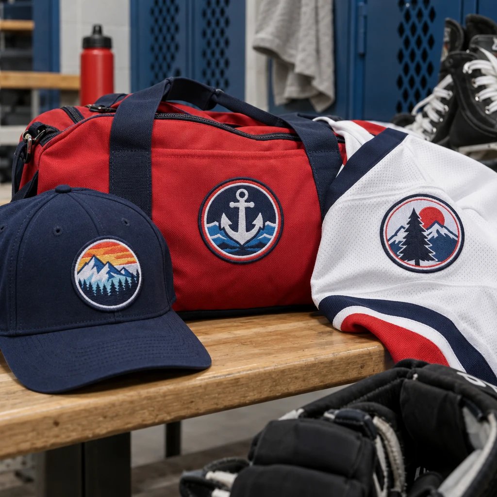
Yes, small text on printed patches can work when the letters have enough height, contrast, and space around them. In this hypothetical example, a 40-person run club needs patches attached to cotton-twill caps for a Saturday race weekend, with 20 business days left before its Friday gear handout. Printing is a sensible starting point, but the club must check the lettering at actual patch size before approving production.
The example order starts with a mountain logo, a club name, a short event line, and a date. Everything fits on a laptop screen. That doesn't mean everything belongs on a cap patch. We'll keep this same hypothetical order through the decisions that actually change the result: art, material, size, backing, quantity, and timing.
How should you prepare small text on printed patches?
Prepare small lettering as clean artwork with simple letter shapes, open spacing, and a background that stays visually quiet. Decide which words must be read first, then remove or enlarge anything that becomes unclear at the proposed finished dimensions.
For this example, the club supplies a rectangular design intended to finish at 3 inches wide by 2 inches tall. The top line reads “RIDGE RUN CLUB.” Beneath the mountain illustration are “RACE WEEKEND” and an event date. A tiny sentence around the bottom edge adds more detail, but it competes with the date and follows a curve that compresses the letters.
I'd remove that bottom sentence. Put it on the event card instead. The patch already identifies the club and the occasion, and keeping a sentence nobody can comfortably read doesn't make the design more informative. It just makes the important words harder to find.
Give every line a job
A text hierarchy is an arrangement that makes the most important words visually dominant. Here, the club name gets the most space, the event line gets less, and the date stays subordinate without becoming microscopic. A person looking across a check-in table should recognize the club name; the date can reasonably require a closer look.
- Make the club name the largest text element and keep it clear of the mountain silhouette.
- Use a plain medium-weight typeface for the event line and date rather than a narrow script or distressed font.
- Replace the busy background behind the date with a solid color field.
- Check the openings inside letters such as A, B, and R, as well as the gaps between neighboring letters.
- Remove decorative outlines or shadows if they consume space without improving recognition.
- Send editable artwork when available, with fonts outlined or otherwise preserved so the lettering does not change during file handling.
In our production experience, thin lettering over detailed artwork is a common weak point. The file may contain every line perfectly, yet the finished patch still asks the eye to separate small words from equally small background shapes. White lettering on a dark, solid panel is the right call for this example because it gives the date a clean place to sit.
Don't use a screenshot as the master file if you have the original logo. A vector file preserves clean shapes during resizing; a suitable raster file can also work, but it needs enough original detail at the intended print dimensions. Enlarging a blurry image doesn't recover the missing letter edges.
If you're unsure which line needs changing, send the proposed dimensions and artwork through the patch artwork contact page for a free digital mockup. Ask to see the smallest line clearly identified, not just a large, attractive preview.
The general lesson: simplify the message before asking the production method to rescue it.
Should you choose printed, woven, or embroidered material?
Printed patches are a practical choice when small lettering shares space with gradients, illustrations, or other fine visual detail. Woven patches can also handle detailed text, while embroidery is better suited to designs that benefit from visible thread texture and roomier lettering.
A printed patch is a fabric badge that carries artwork applied by a printing process rather than formed entirely from decorative stitches. The base material and print method still matter, so the quote should identify the proposed construction. “Printed” describes the approach, not a promise that every fabric surface reproduces tiny letters identically.
| Patch material | What it offers this example | Small-text trade-off | When I'd choose it |
|---|---|---|---|
| Printed fabric | Keeps the mountain illustration, color transitions, event line, and date in one design | Fine detail still depends on the print surface, source artwork, contrast, and finished dimensions | When preserving the illustration matters more than raised thread texture |
| Woven fabric | Forms the design with fine woven threads and a relatively flat surface | Small lettering can work well, but it must still be translated into a thread-based construction | When the artwork uses defined color areas and the buyer prefers a textile-made image |
| Embroidered fabric | Gives the club name and mountain mark visible stitch texture | Tiny letters and narrow gaps need more simplification because stitches occupy physical space | When the club can drop secondary wording and emphasize a bold name or symbol |
For the hypothetical cap order, I'd keep the printed patch construction. The mountain includes a shaded sky, and the date is part of the design rather than optional decoration. Changing everything to embroidery would require a different layout, not merely a different production setting.
If the club later removes the shaded sky and keeps flat color shapes, woven patches for detailed artwork become worth comparing. That's a genuine material decision. It shouldn't be framed as one method being universally sharper, stronger, or better for every logo.
Cost belongs in this decision, but don't guess at a dollar amount from the patch name alone. Ask for the quote in USD against the same dimensions, quantity, backing, and border. Bigger patches and more involved construction generally cost more, while the relative price of printing, weaving, and embroidery depends on the actual order.
If a simpler flat-color option comes back lower and retains the words the club needs, that lower-cost option is enough. There's no production benefit in buying complexity that disappears at cap size.
The general lesson: choose the material for the information the patch must carry, not for a blanket claim about which method is best.
What patch size keeps the smallest line readable?
Choose the finished size by checking both the smallest lettering and the available garment area. There is no universal minimum text height that guarantees readability across every font, print surface, color combination, and viewing distance.
Our example begins at 3 inches wide by 2 inches tall because the club wants the patch on the front of a cotton-twill cap. That is a proposed size, not an assurance that it fits every cap. Crown height, panel seams, curvature, and the sewing shop's access all affect the usable placement area.
See your artwork as a custom USA patch before you buy. Free digital mockup in 12 hours — 5-piece minimum per design. We do not produce until you approve.
GET A FREE MOCKUPSuppose the first layout makes the date approximately 0.10 inch tall. Treat that as an example measurement to inspect, not a published minimum or an automatic approval. The typeface might have open, sturdy shapes that remain recognizable, or narrow shapes that crowd together. The production team needs to evaluate the actual letters on the specified patch.
Check at actual size before making the patch bigger
Start by printing a paper layout at 100% scale and measuring its width with a ruler. Some print dialogs automatically fit artwork to the page, which defeats the exercise. Cut out the rectangle and place it on the intended cap, then look at it both close up and from the distance where someone would normally notice the club name.
Paper isn't a fabric sample. It won't reproduce the material texture, thread border, or exact printed color. It does answer a useful question: is the layout already too crowded before those production variables enter the picture?
In this hypothetical layout, removing the curved sentence lets the date grow from about 0.10 inch to about 0.14 inch tall without increasing the overall patch. Those dimensions are example design revisions, not universal print limits. The important change is that the date gets more room and no longer competes with another line.
Leave room for the border and attachment
A merrowed border is an overlock-stitched edge that wraps the patch perimeter. It gives many simple patch shapes a familiar raised edge, but it occupies space that shouldn't also be assigned to critical lettering. A cut edge may preserve a different outline or visual profile; its suitability depends on the specified base material and construction.
For the example rectangle, the club asks the production team to confirm whether a merrowed border suits the proposed printed base. The mockup should show the border and the text's position inside it. Don't approve a date that sits against the border merely because the screen preview still shows all the characters.
Also tell the sewing shop where it can stitch. A stitch line crossing small letters can obscure them even when the printing itself is clear. Border clearance and attachment clearance belong in the layout together.
The general lesson: enlarge the useful lettering first; enlarge the whole patch only after checking the garment.
Which backing works for cotton-twill caps?
Sew-on attachment is the practical choice for this example because the club has access to a shop that can stitch patches onto finished caps. Iron-on backing may be an option for compatible garments, but a curved cap front requires suitable equipment and careful heat, pressure, and fabric checks.
The backing doesn't increase print resolution. It does affect how the patch sits on the garment and how the buyer installs it. That's why the club should settle the attachment method before approving the order rather than treating it as a packing detail.
I'd specify a sew-on construction for these 40 cotton-twill caps, subject to the sewing shop reviewing the cap model. The shop needs to check access behind the front panel, any internal reinforcement, and the sweatband. A patch that looks centered on a flat drawing can sit awkwardly when it bridges a pronounced cap seam.
Iron-on backing is a heat-activated adhesive layer that bonds under suitable application conditions. It isn't a universal substitute for sewing. A household iron on a curved cap may not apply even pressure, and excess heat can affect the garment or its internal components. Follow the supplied application instructions and garment restrictions rather than borrowing settings from another product.
The answer changes for other garments. On a flat denim jacket panel, compatible iron-on backing may be more practical to apply. On a lightweight polyester race shirt or coated nylon windbreaker, I'd pause before specifying heat application or a large stitched badge because heat sensitivity, puckering, and the garment's intended performance all matter.
Hook-and-loop backing makes sense when the cap already has a compatible receiving panel or the club wants removable identification. It also adds thickness and requires a plan for the mating side. For a permanent race-weekend souvenir on ordinary caps, that's extra construction without a clear benefit.
The general lesson: choose backing for the exact garment and installation method, not for the apparent convenience of the backing name.
How many patches should the club order?
Order against the confirmed wearer count, then decide explicitly whether you need spares or a patch for an attachment trial. USA Customized Patches has a 10-piece minimum; the hypothetical club's 40-piece order is above that minimum.
Forty members and 40 patches leave no unassigned pieces. That's fine if the roster is closed and the installer is comfortable with the job. It isn't fine if the organizer expects to give patches to volunteers, replace a lost cap, and keep one loose patch for the club archive.
For planning, the club could compare a 40-piece quote with a 44-piece quote. In that example, 40 patches cover members, one supports an attachment check, and three remain available for replacements or late additions. The extra four are a hypothetical allocation, not a recommended minimum or a claim that every order needs that allowance.
Ready to spec type, size, backing, and quantity? Open the quote form for a free 12-hour mockup and USA shipping after approval.
GET A FREE MOCKUPThe club in our scenario keeps the order at 40 because its roster is fixed and its installer plans to attach the first patch to a member's cap, inspect it, and proceed only if the placement works. That choice saves unused pieces but accepts the absence of replacement stock. Put that trade-off in writing so nobody expects extras at handout.
I'd also keep one shared design. Adding each runner's name introduces separate artwork and proofing considerations, and the names may vary enough in length to require different layouts. Ask how multiple versions affect minimums, quoting, and timing before turning a single club badge into a personalized order.
The general lesson: count uses, not just people, and make a deliberate decision about spare pieces.
When should you approve artwork for a race-weekend deadline?
Approve only after the design, dimensions, material, border, backing, quantity, and delivery requirements are correct. Then allow separate time for production, shipping, cap attachment, and inspection; a production estimate alone is not an arrival promise.
USA Customized Patches provides a free digital mockup before production, generally in about 12 hours. Production starts only after written approval. Typical production is 7–12 business days, and the schedule for your particular order should be confirmed before you rely on it for an event.
The company ships nationwide from Corona, California, to all 50 states in the United States. Shipping time depends on the destination and service, so review the nationwide patch shipping information and confirm the route for the actual delivery address. USA Customized Patches is open 24 hours a day, 7 days a week for quotes; that availability doesn't turn production or carrier schedules into around-the-clock delivery.
Our hypothetical club starts with 20 business days before Friday's gear handout. That's a planning window, not a guarantee. If approval takes several rounds or transit consumes more of the window than expected, the organizer must adjust the plan before ordering.
- At 20 business days before handout, submit the artwork, proposed 3-by-2-inch size, cap details, 40-piece quantity, and required in-hand date.
- Review the initial mockup when it arrives, generally in about 12 hours, and consolidate corrections into one clear reply.
- Aim to finish artwork review within the first 2 business days of this example schedule, without approving unreadable lettering merely to save time.
- Before written approval, confirm the applicable production estimate and carrier transit plan against the actual destination.
- Reserve 2 business days in this hypothetical plan for cap attachment and inspection, subject to the sewing shop accepting that window.
- Use the remaining time as shipping and contingency allowance only after the production and transit estimates have been checked together.
The calendar math matters. Starting with 20 business days and setting aside 2 for review, up to 12 for typical production, and 2 for attachment leaves 4 business days for transit and any contingency. That is only an example budget. If the confirmed route or workload doesn't fit, the organizer needs an earlier start, a different handout plan, or a separately confirmed scheduling option.
Approve the specification, not just the picture
A digital mockup is a visual approval document that shows the proposed layout and order details before production. It isn't a physical print sample. Screen brightness, zoom level, and display color can make fine lettering look more forgiving than it will on fabric.
- Confirm that 3 inches wide by 2 inches tall describes the finished patch, including the agreed edge construction.
- Check every character in the club name, event line, and date.
- Verify the printed material, border treatment, sew-on construction, and 40-piece quantity.
- Review the smallest lettering at actual scale and ask about any unresolved reproduction concern.
- Confirm the shipping address and distinguish the needed arrival date from the race date.
- Record written approval only after the final revision and order specifications match.
If the simplified artwork now favors bold thread lettering over the shaded illustration, request a free digital mockup through the embroidered patch options before committing to that material change. Compare the revised layout at the same finished dimensions rather than assuming the printed design transfers unchanged.
The general lesson: protect approval time and attachment time instead of spending the whole schedule on production.
What this advice is based on
This advice rests on the patch-production process, the digital mockup step, and the specifications needed to quote and build an order. The run club, its artwork, its 40-piece quantity, and its planning calendar are hypothetical examples, not a customer story.
In our production experience, small lettering must be evaluated as part of the complete construction: source art, printed base, finished dimensions, border, and attachment location. No study or universal text-height rule is being claimed here. The example letter heights illustrate a layout decision, while the actual artwork still needs review for the selected construction.
The general lesson: the useful next step is to measure the garment's available space and supply that measurement with the artwork. Write “finished size” beside the dimensions, identify the smallest line that must remain readable, and have those details checked before you approve.